New Portfolio Post
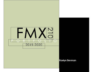
This is my portfolio which took me about 8 hours to construct because I didn't use a template and decided to play with fonts and color schemes for a while. For some reason I could only get half of the pages to line up on Blogger, (not really sure why). Overall, I really like the way it came out by breaking up some of the text with the art to take up a whole page. I worked really hard on each of these projects individually and I think my portfolio showcases them well. Throughout the class, I enjoyed learning all of these programs which in turn helped me create this versatile portfolio to which I will continue to expand on!


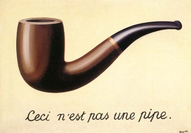
This is my favorite project of yours Raelyn! I think you knocked it out of the park and did an amazing job. I was always fascinated by this piece of art so seeing you turn it into a calligram was really cool. The shape of the pipe looks impressively accurate and must have taken a lot of practice with the pen tool. The placement of text in lighter colors to portray the reflection on the left of the pipe is very realistic. Overall I think you did great.
ReplyDelete