Posts

New Portfolio Post

Image
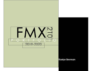
This is my portfolio which took me about 8 hours to construct because I didn't use a template and decided to play with fonts and color schemes for a while. For some reason I could only get half of the pages to line up on Blogger, (not really sure why). Overall, I really like the way it came out by breaking up some of the text with the art to take up a whole page. I worked really hard on each of these projects individually and I think my portfolio showcases them well. Throughout the class, I enjoyed learning all of these programs which in turn helped me create this versatile portfolio to which I will continue to expand on!

In Design Tutorials

https://www.youtube.com/watch?time_continue=466&v=wPFEzHXOdCs&feature=emb_logo This video helped me set up the basics of my portfolio in the booklet layout as well as repating some of the steps we learned in class with making text-boxes, color fill, and fonts. https://www.youtube.com/watch?v=bjD4zhAvF7s This tutorial helped me with text wrapping as well as giving me some inspiration for how I set up my portfolio (big pictures filling the entire page on one side and text on the other). https://www.youtube.com/watch?v=atS36kzr8zg This video was interesting because it was explaining the do's and don'ts of InDesign and what to look for when creating your own template stylistically. This video also gave me the idea to turn my "210" on it's side in "FMX210" on my cover page of my portfolio.

Portfolio Review

Image
This is my portfolio which took me about 8 hours to construct because I didn't use a template and decided to play with fonts and color schemes for a while. For some reason I could only get half of the pages to line up on Blogger, (not really sure why). Overall, I really like the way it came out by breaking up some of the text with the art to take up a whole page. I worked really hard on each of these projects individually and I think my portfolio showcases them well. Throughout the class, I enjoyed learning all of these programs which in turn helped me create this versatile portfolio to which I will continue to expand on!

Business cards

Image
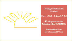
These are the 3 business cards I produced with my sun logo. (For some reason uploading them to my blog has made them a bit fuzzy might have to re export them and repost). I like my first logo best because of the color scheme and the way the sun sticks out on the peach background and the second one I used the gradient swatch tool to fade the yellow radially and linearly which I thought gave it a nice effect. The third one is my least favorite because of how color blocked the logo is on the back side.

Tag Brush

Image
Here I have posted both my original tag brush that is made out of my logo layered with scratches and spray throughout. The second image is my tag brush duplicated with some color variance which gave the double beamed rays look I was going for in some of my original sketches of my logos. I chose yellow and blue for the second tag brush to represent the sun and sky meshing together which gives off a bit of green hue and I like to think brings more of an earthy element to the color scheme. For as simplistic as my logo is I actually liked how the tag brush came out with the grainy textures added from the layering.

Puppet Project

Image
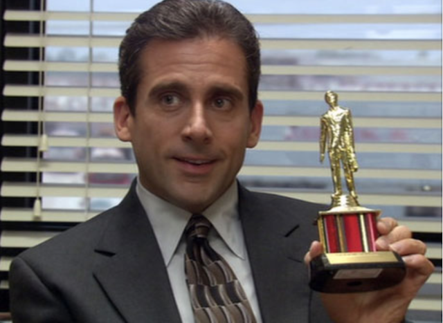
For this assignment we had to turn ourselves into some sort of toy/puppet/figurine and place ourselves in a setting we had not been in before. I racked my brain for a while to think of what I would like to turn myself into and at first I thought of turning myself into an Oscar Award, and then it hit me... what about a Dundee! One of my favorite episodes (of one of my favorite TV shows) The Office is called, "The Dundies" where Michael Scott gives out ridiculous awards to his employees such as "hottest in the office". I am a Com major with a concentration in scriptwriting and because I am currently in many classes that are centered around writing for film/television I think that is why my mind went straight to incorporating myself into a show!

B&W to Color

Image
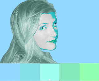
Analogous Complementary Compound Monocrome Triad Shade For this assignment we had to take a picture of ourselves and turn it to black and white and then again to various colors. In all, this assignment probably took me close to seven hours to complete. I enjoyed layering effects over the colors which gave my eyes different levels of vibrancy in some versus others where I used less effects. I had the most trouble masking out some of my hair due to the original picture having a lot of fly aways however, I was able to play with the feathering and smoothing tools to avoid any rough patches of hair. I also enjoyed playing with the opacity of the background as some I maxed out at 100% such as the Analogous and Shade images while the other images I toned it down. I also tried to pick different colors to keep each image distincatly different.